Report of the FHWish-L Study Group
First: Some "Grand Vision" sorts of things. These suggestions
have much to do with the underlying technology, and little to do with "features".
If FreeHand is going to maintain or increase it's market share, it must
respond to the changing technological landscape. The future of professional
graphics lies as much, or more, in the technological underpinnings as in
the features list. We see these items as issues for FH7+2 or later. However,
implementing them will require some significant reengineering, and that
job should be begun as rapidly as possible.
FreeHand unshackled from PostScript
FreeHand was conceived as a program that puts the power of PostScript
into the hands of users. That was about 1988. In almost a decade since then,
PostScript, though it has held up admirably, is beginning to show it's limitations.
Our reading of the tea leaves indicates to us that the future of PostScript
is not bright, despite Apple's purported move to adopt something based on
Display PostScript. Adobe itself has begun to promote a son-of-PostScript
called Bravo (basically an API-based PostScript). In all this uncertainty,
we hope that Macromedia will become a vigorous voice in favor of a modern
API based imaging model similar in capability we would hope, to Apple's
lamented Quick Draw GX.
A move in this direction would require abandoning, at the very least,
FreeHand's custom PostScript strokes and fills. These capabilities should
be available without programming anyway, and suggestions for largely replacing
them are included later in this report. As much as some of us have enjoyed
tinkering with custom UserPrep files over the years, it's not the way for
software to treat grown-ups.
Transparency
If ever there were a holy grail for object-based illustrators, it is
that objects should be able to interact with their background. This means
transfer modes, and for most users, simulated transparency. Transfer modes
(e.g. "opacity") should be able to be set for each object or style.
It should also be possible to have transfer modes that can be modulated
by gradients or even placed alpha channel images (e.g. solid at one end,
transparent at the other end), either at the single object level, or at
the group level. Imagine the FreeHand warrior: solid at the eyes, and fading
into gossamer smoke as you move outward. Or imagine a shadow falling across
the face of that same warrior, without laborious cloning, adjusting colors
and pasting inside a path. Just put on a shadow! Move it if you like!
Transfer modes, useful as they are, would trip over at least one quite
pedestrian complication: halftone screens. Objects may no longer be allowed
to override their default halftone settings lest they run afoul of the halftone
settings of any object that may be in front or behind. In process color
spaces, this would probably not be a big problem. However, in spot color
and hybrid spot&process color spaces, this could be a significant problem.
This is just one argument, and not the most significant one, in favor
of stochastic screening. We hope that stochastic screening will have moved
enough into the mainstream by the time that FH7+2 comes around, that the
decision to support it will be quite an easy one.
Lean and Mean FreeHand
With each revision, the RAM footprint of FreeHand has grown significantly,
while speed, even on ever faster systems, suffers. We feel that the architectural
underpinnings of FreeHand need to be reorganized so that only a relatively
small and fast "core" needs to remain loaded, while much FreeHand
functionality loads into RAM only when it is required, and disappears when
it's not needed anymore. We would like to see a comprehensive API to the
core FreeHand services made available to developers. Much of the FreeHand
"that we see" would be implemented through dynamically loadable
software modules communicating through this API, and third party modules
would share full access.
Now we move on to more down to earth suggestions which, we hope, will be
seriously considered for FH7+1.
Point Symbols
The most important power in FreeHand's graphic styles lies in the ability
to abstract the graphical manifestation of something from the meaning
, or information that it represents. This allows, for example, a "road"
to be a "road" even if the graphical definition of a road is modified.
This is extremely powerful in graphics where information is conveyed via
symbology, as in cartography and other forms of technical illustration.
Unfortunately, FreeHand styles only work for path-based symbology (strokes
and fills). There is no facility for working with point symbology. For example,
it is not possible to define a graphical style for an object: "city
- 250,000 to 500,000"). One must draw the symbol, and then copy-paste
or clone a copy for each instance in the illustration. Should it become
necessary to modify the symbol, then each instance must be replaced manually.
We propose a new type of graphic object. Names suggested include: "point
symbol", "symbol", "push-pin", "stamp".
Basically, it is something whose symbolic meaning lies in it's object-ness
, not only in how it is stroked or filled. Point symbols may contain any
kind of graphics: multiple colors, even color images! And point symbols
may contain text (as in, for example, an exploded drawing of a machine with
numbered call-outs to various parts). Ideally, text would be editable in
each instance (overriding the default text in the symbol definition) without
loosing the linkage to the symbol definition.
Point symbols may require a new kind of atomic FreeHand graphic object.
At the level of graphic primitives, FreeHand currently has path entities,
and text entities. A path object consists of a series of coordinates indicating
the course of the path, together with attribute information (stroke and
fill, style linkage, etc.(e.g. user-note, lock)). A text object consists
of coordinates for a bounding box, a styled text object (which in turn consists
of a list of text objects each linked to it's own text style), etc.). A
point symbol object would be simpler than either of these two - it would
consist essentially of just a single transformation matrix (indicating location,
scale and rotation) and a style linkage.
The User Interface:
We would propose a user interface something like the following. Placement
of point symbols would primarily be accomplished by a special point symbol
drawing tool (a "rubber stamp"?) which would live in the FreeHand
toolbox. It would place instances of whichever point symbol definition is
"active". A single click places an unscaled, unrotated instance.
Click-dragging without any modifier keys would modify rotation and scaling
(as with the polygon tool). The shift key would constrain rotation. The
alt/option key would constrain scaling. The alt/option key together with
the shift key would prevent rotation while enabling differential x/y scaling.
An alternative method of placing point symbols would be to drag and drop
from the point symbols panel.
Point symbols would be managed from their own panel. This panel could
have three display modes (selectable under the "Options" pop-up
menu): symbol name only; symbol name and thumbnail view; thumbnail view
only. In tumbnail-only view, the panel could be freely resized in both vertical
and horizontal. As with graphic and text styles, one point symbol definition
would be active at all times, and there would be a default "Normal"
point symbol definition always present (a "bullet" or "+"
symbol).
In almost all ways, symbols would behave like graphic styles. We have
chosen to suggest that they have a panel separate from the styles list for
two reasons. The first is the practical issue of displaying thumbnails.
Without reconfiguring the styles list, this would not be tenable. The second
reason is that most people would have difficulty conceptualizing a wholly
formed "thing" (the symbol) as simply a graphic attribute.
Creating new point symbol definitions could be accomplished in one of
two ways. The first would be to use a point symbol inspector which looks
very much like the tiled fill inspector. After choosing "New"
in the "Options" pop-up menu to create the symbol definition (using
the currently active symbol as a template), the user would copy a graphic
to the clipboard, and then paste it into a small window in the inspector
panel (which would initially contain the previously active symbol definition).
The symbol origin would be indicated by cross-hairs (by default, located
at the center of the bounding box). When the cursor is moved over the intersection
of the cross-hairs, it would change appearance indicating that by clicking
and dragging, the origin can be relocated. Elsewhere on the panel would
be numeric entry fields to change the scales (x and y) and rotation of the
symbol. Typing the <enter> key would cause the selected symbol, or
if no symbol is selected the symbol definition, to be modified.
A second method would employ drag and drop. Dragging a selection over
a drop box in the point symbols panel would create a new point symbol definition,
in the same way that dragging a color swatch over the drop box of the color
list creates a new color. Dropping a selection on an existing definition
in the point symbols panel would redefine the definition.
Other aspect of operation:
Dragging a thumbnail from the point symbols panel into the drawing would
place an instance of the symbol at the location where it is dropped unless
it is dropped on top of an existing symbol, in which case, the existing
symbol would adopt the new definition. If a point symbol is currently selected
in the drawing, clicking on a definition in the point symbols panel will
apply that definition to the selected point symbol. These behaviors are
consistent with how styles currently behave.
Selecting an instance of a point symbol will cause it to hilight. One
suggestion is to draw a bounding box around the symbol, similar to the bounding
box that appears around selected text, except that it would appear in the
hilight color for that layer. It would rotate with the symbol, as is seen
with text objects. The origin of the symbol would be indicated with a standard
selection handle, drawn in the hilight color. A consensus on the exact arrangement
of other handles has not been reached. The symbol should be able to be moved,
scaled or rotated without using any tools other than the selection arrow.
One idea is to have an open box handle at the lower right corner of the
bounding box. Dragging this handle would rotate and scale the symbol, but
the origin would not move. In other words, it would scale and rotate around
the origin. Holding down option/alt could disable rotation while allowing
differential x and y scaling. All transformation operations (tools and panel)
would use the symbol origin as their default origin. Dragging a symbol would
behave almost the same way as dragging a group: a quick drag will show the
bounding box and origin handle; a slow drag will show the bitmap overlaid
by the origin handle. Displaying the origin handle will allow snapping the
origin to a particular point.
As proposed earlier, text within a symbol would be editable in each instance.
This text would override the default text contained in the point symbol
definition. Only the actual raw text could be changed, the text style (font,
size, leading, alignment, etc.) would remain fixed.
Benefits:
Point symbols would be useful in a number of ways. It would make placing,
modifying and otherwise manipulating multiple instances of graphic elements
much more efficient. This is especially beneficial in cartography, where
point symbols are used extensively, but it would be equally useful in other
forms of technical illustration. Because each instance of a point symbol
in the file/data structure will contain only a transformation matrix and
a pointer to the original, it has the potential in some cases to reduce
file size significantly. Along the same technical vein, the rendering of
point symbols to the screen and to the printer could be optimized by rendering
once and caching a bitmap in memory (as is done with PostScript type). The
freedom to quickly and easily place many instances of point symbols without
concern for file and memory usage or performance degradation, will enable
hand stippling and other textural techniques that are not normally associated
with vector oriented drawing software.
Other technical considerations:
Graphic styles, text styles, and even point symbol styles linked to parts
of an object that is used to create a new point symbol would remain linked.
The symbol definition would reflect any changes in embedded style and symbol
definitions. The only limit would be that a point symbol definition could
not contain an instance of itself! Attempts to define a symbol this way
would be responded to with a dialog that offers to decompose (ungroup) the
conflicting constituent point symbol object(s) prior to proceeding with
the redefinition.
Using the Ungroup operation on any point symbol instance will cause the
object to be rendered directly into the file, and linkage to the symbol
definition will be lost. All style and symbol linkages to constituent objects
will be maintained however.
Point symbols should probably be implemented as a native FreeHand capability,
and not through an Xtra plug-in. This recommendation is based on the current
Xtra SDK which does not appear to provide the necessary hooks to implement
point symbols effectively. The recommendation is also based on the opinion
that point symbols represent an "atomic" graphic type that should
be part of the the basic graphics toolkit, not an afterthought. And finally,
point symbols would be of value to a large proportion of FreeHand users.
Converting a FreeHand file with point symbols to other file formats,
including older versions of FreeHand, would necessitate rendering the symbols
into their constituent graphics. However, most of these file formats allow
comments to be embedded, and information to reconstruct the point symbol
definitions and linkages upon re-import could be preserved this way (as
layers are preserved in files exported to earlier Illustrator formats).
To make room for the point symbol tool on the Toolbox panel, we recommend
moving the Autotrace tool somewhere else. The Autotrace function, valuable
as it is, fails to justify it's status as a front-line tool. We feel that
it should be a dynamically loadable external module (Xtra).
Powerful Graphic Styles
In cartography, there is commonly a need to create path-based graphics
that are more complex than the various forms of PostScript stroking, and
which is not met by FreeHand's text and blend on-a-path capabilities. Additionally,
because cartography (and much technical illustration) is based on symbolic
graphics - where the appearance of an object in the illustration conveys
explicit meaning - there is a need to have these more powerful path-based
graphics accessible in style definitions.
A very common case:
A road is typically drawn by first stroking a path with a wide black line,
and then stroking an identical path with a narrower-width non-overprinting
fill color. Currently, the user must place two copies of the path and apply
different strokes to them to achieve this effect. If he finds it necessary
to edit the road, he must either apply identical edits to both paths, or
delete one, modify the other, and then clone, change layers and reapply
the stroke. The user should be able to have a single path which is automatically
stroked twice, or more.
Another case:
A power line is typically drawn with some sort of stroke or parallel strokes
along the line, and with symbols placed at the path vertices indicating
the locations of the poles. These symbols may be rotated with respect to
the 2D normal of the vertex. The power line symbol may require that gaps
appear in the connecting line at the vertex symbol to create a white space
around the vertex. Despite the fact that a power line is symbolically a
single path, the user must create much extra artwork which is then very
difficult to edit.
And another case:
Dashed lines are very commonly used to differentiate various kinds of paths
in a network of paths. Unfortunately, when dashed lines meet, it is very
difficult to ensure that they will intersect cleanly. What is needed is
the ability to justify (stretch or shrink) the dash pattern so that they
begin and end in a controlled way.
In each case, we have a need to associate complex symbology with a single
path. This issue divides naturally into two parts:
More powerful styles e.g. objects along a path, justified dashes.
Renderings of multiple line styles on the same path.
So let us take them one at a time...
More powerful path styles
We would like to see the following additions to the style toolkit. They
are not listed in any particular order, except where one idea forms a prerequisite
for a later one.
Justified (fitted) dash patterns
Start of path - half dash, half gap or unadjusted.
End of path - half dash, half gap or unadjusted.
FreeHand would adjust the dash and gap length(s) to have the beginning
and ending of the path come out with a half dash or half gap. (It is assumed
that any dashed line definition begins with a dash and ends with a gap,
or vice versa.) If the half-dash mode is chosen for start and end, then
paths intersecting each other will always have solid intersections, and
two paths placed end-to-end will have a full-dash forced at their point
of contact. If half-gaps are chosen, then intersecting paths will have an
open intersection, and two paths placed end-to-end will have a gap forced
where they meet. Dangling ends which do not meet with another path would
normally use a half gap so that visibly, they end with a full dash.
The dash justification parameters would be a part of the dash pattern
definition. We suggest that the dash pattern editing dialog box include
a pair of pop-ups (or sets of radio buttons) which enable choosing the start
and ending justification modes. Finally, a check box would allow the dash
pattern fitting to be performed between vertices instead of end-to-end of
the path.
We also suggest that the dash pattern editor become more complete so
that dash patterns can be explicitly created (from scratch or based on the
currently chosen dash pattern), modified or deleted. Dash patterns should
be able to be named, as are colors and styles. In effect, dash patterns
should be managed as a library, just as styles and colors are.
Offset strokes
The primary intention of offset strokes is so that multiple parallel
strokes can be rendered from the same path. Applied to a single stroke on
a single path, it has little use. But when used to render two or more parallel
strokes from the same path (using the multi-styles feature discussed later),
it opens up a whole world of possibilities.
All stroke inspectors would include a "stroke offset" field
where a distance value could be entered (default = 0) to displace the stroked
path parallel to the actual path. The line join parameter (miter, bevel,
round) could determine how this stroked path would go around the corners
of the actual path. This feature, together with multi-styles which are discussed
separately, would enable multiple, differently styled strokes in parallel,
on a single editable path. In the case of a filled closed path, the fill
would be applied to the area enclosed by the offset path, not the actual
path.
One concern has to do with how dash patterns should be rendered on an
offset stroke. Our preliminary conclusion is that they should be rendered
normally for the offset stroke - not projected from the parent path. Consider
a situation where you have a path which is a closed circle, and you create
two identically dashed lines parallel to it: one offset inside and the other
outside. If the dash pattern is projected from the parent path, then the
dash patterns would remain synchronized on the offset paths. This argument
in favor of projecting is persuasive. However, we anticipate that the performance
penalty for this would be steep, and there are equally compelling cases
to be made in favor of not-projecting: suppose you had parallel lines, only
one of which is dashed - you probably wouldn't want dash lengths varying
by some hidden controlling path. To achieve "bilateral symmetry"
(to borrow from biology), where you would want the pattern to project laterally,
there are two approaches that work for two different cases: In the case
of the parallel dashed lines, the "traditional" approach of a
wide dashed black line knocked out by a narrower infill line still works.
It looses the benefit of a see-through center, however. In the case of a
patterned path (see next section), a lateral projection can be accomplished
by offsetting the object's origin.
Another concern of offset paths is: where do you click to select the
object? Clearly, one should be able to click on any displayed portion of
the object. Once the object is selected, the parent path, with it's vertices
and control handles should appear. We recognize that this may be difficult
to engineer. FreeHand's "left hand" would have to be thinking
in terms of the paths *as rendered*, while it's "right hand" would
have to be thinking in terms of the simple parent-paths.
Objects along a path, or "patterned paths"
Any FreeHand object or group (even image objects) should be able to be
instantiated along a path at render time. These objects would not exist,
except as part of the path stroke style definition.
Placement modes should include:
At first vertex.
At last vertex.
At intermediate vertices.
Patterned along the path using a dash pattern (with associated justification
modes).
Rotation modes should include:
Unrotated.
Rotated relative to the 2D normal of the vertex or to the tangent of the
path if it is not being drawn at a vertex.
Same as relative rotation on a vertex except that when the interior angle
of the vertex is less than 90 degrees, add 90 degrees to the rotation of
the object.
The stroke inspector would add a stroke mode called (something like)
"Patterned". The contents of this inspector, in no particular
order, would include: A paste-in window (as for tiled fills) for the particular
graphic which is being distributed along the line. A draggable cross-hair
in this window would allow modification of the object origin (bounding box
center is default except for point symbol objects which would use their
own origin by default) There would be three check-boxes for selecting placement
at the first vertex, last vertex, and/or intermediate vertices. A standard
FreeHand dash pattern pop-up, would be used to select a distribution pattern
("None" is default). If a dash pattern is selected, two check
boxes would become enabled to select whether the objects should be placed
centered on dashes, or centered on gaps, or both (leaving both unchecked
would cause no pattern placement to happen). A set of two radio buttons
or a pop-up would allow choosing the rotation mode: none or relative rotation.
If relative rotation is selected, a check box would be enabled to select
"add-90" for small interior angles at vertex placements. Finally
the "standard" (as proposed earlier) stroke offset field would
be used to set the stroke off parallel to the actual path.
The ability to render objects at the first or last vertex eliminates
the need for arrowheads and the arrowhead editor. We would suggest that
when FreeHand opens FH7 and earlier documents with arrowheads, that a multi-style
be created, with the path stroke being one (typically basic) style, and
the arrowhead be a patterned style.
The special case rotation mode which we are calling "add 90"
(for lack of a better term) has an application where the object being placed
is intended to appear cross-wise to the direction of the path. If the inside
angle of the vertex is smaller than 90 degrees, then adding 90 degrees to
the rotation of the object maintains the correct orientation.
Combining patterned paths with other stroke types through the use of
multi-styles (discussed next) enables the creation of a variety of complex
strokes. For example, a railroad track with cross-ties that look like real
wood. Or, the train itself. The cars could be repeated along the track.
Multiple styles applied to a single path ("multi-styles")
The principle focus of this enhancement is the ability to layer strokes
in order to create effects such as roads, railroads, neon lights, caterpillars,
etc. But fills would be layerable also (indeed they must be). Multi-styles
would be implemented by creating two new classes of styles - one for multiply-filled
and/or stroked paths, and a second for multiply-filled and/or stroked text.
We envision the creation of a new inspector, the "Style Inspector".
This inspector would manage the various flavors of style linkages. Whereas
FreeHand currently has two kinds of styles (graphic and text), we propose
four kinds: "Basic Graphic" and "Basic Text" which would
be identical to what we have now, plus "Custom Graphic" and "Custom
Text". Where the fill and stroke inspectors have a popup menu of different
variations on fills and strokes (e.g. "basic", "custom"),
this style inspector would have a popup menu of these four style types.
In the styles panel, each type would have it's own distinctive mini-icon/swatch
that would appear next to it (as is the case now for the two style types).
And each new style type would have it's own "Normal" version which
can't be changed, and which can't be removed from the styles list.
The style inspector panel would change to reflect the currently active
style type. Each type of panel would represent the style's components with
iconic swatches and textual names or descriptions. "Atomic" components
of styles can come from the stroke and fill inspectors, and in the case
of text styles, the text inspector, the color mixer or color list. These
components would be added or modified by creating/editing them in the fill,
stroke or text inspectors, and from there dragging a swatch to the appropriate
"swatch bucket" in the style inspector. An existing style (named
or unnamed) can also be included as a component of a new style by dragging
it's swatch into the style inspector (more on this in a moment).
The two "basic" style inspector panels would be pretty sparse.
The "Basic Graphic" inspector would have just two swatch buckets,
one for the fill and one for the stroke. The "Basic Text" inspector
would have one swatch bucket for the text component, plus a color-swatch
bucket (supplied from the color list or color mixer), and an overprint checkbox.
The "Custom Graphic" inspector would consist of a list window,
into which swatches can be dragged from their respective inspectors. Additionally,
compatible styles swatches can be dragged from the styles list or other
instances of the styles inspector! Yes, a custom graphic or text style can
contain, as components, fully formed basic graphic and custom graphic styles.
The rendering order of these style components would be determined by their
order in the list: the bottom one is rendered first, the top one is rendered
last. Each row in the list would contain three fields: the first where the
swatch is displayed, a second which contains a check-toggle for forcing
overprint, and the third - a name field for that component. If the component
is another graphic style, this field would display it's name (or the name
of it's parent+). If the component is imported from the fill or stroke inspector,
then it would simply be named something like "Stroke-3", or "Fill-1".
Additionally, the custom graphic inspector would have a numeric entry field
for increasing or decreasing the width of all included strokes.
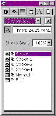 The "Custom Text" inspector would be identical
to the custom graphic inspector except that it would contain a separate
swatch bucket at the top for one text swatch. It would be able to contain,
as style components, graphic styles (basic or custom), but it would not
be able to contain a text style. The custom text inspector, as we envision
it, is depicted in the accompanying illustration.
The "Custom Text" inspector would be identical
to the custom graphic inspector except that it would contain a separate
swatch bucket at the top for one text swatch. It would be able to contain,
as style components, graphic styles (basic or custom), but it would not
be able to contain a text style. The custom text inspector, as we envision
it, is depicted in the accompanying illustration.
Needless to say, a style component could not be the containing style
itself, and any other circular references would likewise be illegal (e.g.
MotherStyle>DaughterStyle>MotherStyle). FreeHand would have to maintain
a "family tree" and prevent these situations.
At some standard position in every one of these inspectors (fill, stroke,
text, style) there would be a "swatch fountain" (same as a swatch
bucket except that it donates rather than receives). Adding style components
to the style inspector would be accomplished by dragging swatches. Modifying
fill, stroke and text components is pretty easy too: when the component
is selected, the appropriate fill, stroke or text inspector can be used
to modify it, and typing <enter> commits the changes, or the new swatch
can be dragged and dropped on top of the original swatch.
Modifying a style component, however is somewhat more complicated...
Which brings us to multiple style inspectors. They are needed for working
with nested unnamed styles (where a style contains, as a component, an unnamed
style). Double-clicking on a style component in a style inspector, would
pop up a new style inspector with that component style loaded. This way
nested style components can be modified. This daughter (or grand daughter,
or great grand daughter) panel should perhaps have it's lineage displayed
in it's title bar, or in some other way.
The other situation where multiple style inspectors would be needed is
when you want to create an unnamed nested style. Suppose you've got an object
with an unnamed style applied to it. Now you would like to use that style
as a component in a new style. To have a source to drag it's swatch from,
and a destination to drag it to, you need two inspectors. Selecting the
source object in the drawing would hilight it's (unnamed - i.e. "<parent>+")
style and load the various inspectors, erasing the style that you are building!
So, we propose that option-dragging an inspector tab would clone that inspector.
Initially, the cloned inspector would have the same settings as the original.
Then you could safely select an object, and it's settings would appear in
the cloned inspector. You could modify the style as desired. Now you could
drag from it's swatch fountain to a swatch bucket in the other style inspector,
or type <enter> to commit it. The active style inspector panel would
behave just like when there is only one inspector, the inactive ones would
simply maintain their settings.
Other issues:
Since we now have an inspector that is explicitly for styles, some of the
functions of the styles list could be move to, or duplicated in, the styles
inspector. In particular, it makes sense to be able to name styles in the
styles inspector. Some operations, like creating new styles and redefining
old ones can be accomplished by dragging swatches from the inspector to
the list, rather than using the Styles|Options menu.
There need be no concerns about loosing "the old way" of creating
graphic settings. If you have an object selected, and you fiddle with the
stroke and fill inspectors, hitting <enter> will apply those changes
just exactly as it does now. In fact, users who do not wish to ever see
the styles inspector, could do everything exactly as they do it now!
The styles inspector would have a popup menu with the four style types,
but it would not be possible to convert a style from text to graphic or
graphic to text. However, since a custom text style can contain graphic
styles, this is not an onerous restriction.
Related to these multi-styles, we would suggest that a new kind of compositing
(joining) be created between non-touching paths which would allow the stroking
(and filling) order to be applied across multiple paths instead of one path
at a time. For example, if a multi-style were created for two-line filled
road (a wide black stroke knocked out by a narrow light-colored stroke),
a pair of these paths which intersect would not show an open intersection.
By compositing these intersecting paths, the first component style of the
multi-style (the wide black line) would be rendered on both paths before
the second component (the narrow fill-color line), thus creating the open
intersection. Currently, the join-non-touching-paths operation creates a
path segment between the closest ends of the paths, which is not what is
needed here. We suggest that the "Join" command be split into
two commands: "Join Paths" and "Composite Paths". The
"join non-touching paths" preference would apply as before to
the Join Paths command.
We understand being able to combine open and closed paths in a single
composite object makes the rendering operation more complex. PostScript's
even-odd fill automatically closes any open sub-paths. The overhead necessary
to resolve this will make processing of composite objects containing open
and closed paths slower. However, we feel that this will not have a serious
impact except possibly in the most extreme cases (very complex multi-styles
applied to many complex composite objects). These cases should be rare.
This is again a case where the Xtra API does not currently provide the
necessary hooks so that these capabilities could be implemented in a way
that is reasonably transparent to the user, if at all. And, even if the
hooks were provided, we would still wish that these capabilities be part
of the standard FreeHand distribution so that files created using multi-styles
be portable. As is our general recommendation regarding non-core FreeHand
features, we would suggest that serious consideration be given to some or
all of these features being provided through optionally loadable run-time
software.
Mixing spot colors
Many graphics disciplines, cartography included, traditionally work in
spot color. The emphasis in FreeHand and other graphics software on halftone
based process color has ill-served many users who have very legitimate reasons
to prefer to use spot color. Completely ignored in FreeHand are the facts
that spot color users need to be able to mix their spot colors together
to make new colors.
Therefore, we are suggesting that FreeHand incorporate the ability to
explicitly mix spot colors, and tints thereof, to make new colors. Recognizing
concern that users may inadvertently mix colors with incompatible halftone
screen angles, we have built our proposed spot color mixer around the concept
of six "legal" halftone screen angles: 0, 15, 30, 45, 60 and 75
degrees. A prerequisite to this idea is that FreeHand, when spot colors
are created, attempt to assign optimal screen angles, and inform the user
when a certain color may develop problems at a chosen screen angle. Dark
colors should, for example, occupy the 15, 45 and 75 degree slots.
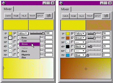
As shown in the accompanying illustration, the spot color mixer would
have six sliders, one for each of the six legal screen angles. Next to each
slider is a pop-up which when clicked, presents a choice of the available
ink colors. Near the top of the popup (below "None") are the colors
which have that halftone screen angle as their default. Below a separator,
in italics, appear all the remaining ink colors. If a color from the bottom
section is chosen, it will be rendered in this row's screen angle,
for this particular color mixture only . When you've chosen a particular
ink color, it's name appears in the pop-up, and it's screen color representation
appears in the swatch box to the left. Check boxes allow two colors to be
selected which are then displayed using cross-gradient in the large box
below, mixed with whatever other other separations are being blended. Clicking
in the gradient window will vary the relative values of the two selected
colors, while the other separations remain constant. In this example, the
user is creating a mixture of two process colors and two spot colors. In
the left panel, he is adding the spot color brown. The right panel shows
a completed mixture. This color gets displayed in the right side of the
color well at the top of the mixer panel (the left color well is the currently
active color). It can be dragged to the color list to create a new named
color, or dragged directly to a selection. The process colors: Cyan, Magenta,
Yellow, Black, Orange and Green (the last two for Hexachrome) would
also be available in the pop-ups, and you could mix up a color that combines
the traditional process inks with spot colors. If the currently active color
is a process color, then the sliders/pop-ups would simply show the mixture
of the these inks.
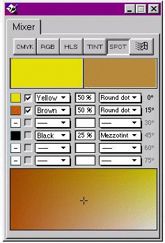
An alternative suggestion for a spot color mixer is shown here. It is
basically an extension of the idea already proposed, to include the ability
to define halftone screens within a color definition. The sample here shows
the same color as created above, but uses a mezzotint screen for the black
ink. Not shown here, but necessary, would be a the ability to define the
frequency of each screen also.
Stochastic Screening
The graphics arts industry is excited about stochastic screening because
of it's ability to render many types of graphics with much higher fidelity,
and of course this is interesting to us as well. However, at least as interesting
to us is that it completely eliminates halftone screen clash (moirés).
Among the graphic arts, cartography is famous for it's occasional use of
large numbers of spot colors (a Swiss cartography text list 12 "standard"
spot colors). But even mainstream cartographic usage often involves various
combinations of two or more spot color tints. The difficulty of managing
the screen angles goes up geometrically with each new color combination
and each overprinting tint. Stochastic screening completely eliminates screen
clash, and thus would simplify the management of spot colors dramatically.
Tiled fills with image tiles
We recommend that Tiled Fills be enhanced to include the ability to tile
an image object. Currently, only FreeHand vector objects can be tiled. Tilable
images would, among other things, enable very flexible texturing, making
Textured Fills redundant and unnecessary. Current textured fills could be
supported by providing an image library which duplicates the current selection
of textures, and using them to synthesize appropriate image-tiled fills
when importing FH7 and earlier documents. We would further suggest that
this opportunity be used to provide a much larger library of textures (in
the form of small image files) than can practically be implemented as built-ins.
Hierarchical list views
FreeHand has always appealed to technical illustrators (including cartographers)
because of it's ability to manage colors, graphic and text styles,and layers.
Unfortunately, often these lists become very long and difficult to manage,
and they take up more screen space than we would like. We would like to
suggest adopting a hierarchical list strategy, similar to the Macintosh
Finder's list view, or the Windows Explorer, with folders which contain
sub-lists and/or sub-folders. Moving a folder up or down in the list would
move it's contents as well. In addition to these general benefits, folders
in the layers list would enable whole groups of layers to be moved in the
layering order, displayed, locked, etc. The layers list would contain two
permanent folders: foreground and background.
Stroke width adjustable with handle
It should not be necessary to enter numbers in an inspector for every
little adjustment a user wishes to perform. We would like to see a special
handle which appears on a hilighted path to allow modifying the thickness
of the stroke. It would appear at the head or tail end of the path, and
stick out at right angles. Dragging it in or out would vary the width of
the stroke. In the case of multi-styles, it would scale all strokes; in
the case of patterned strokes, it would scale the objects. However, it would
not change the dash pattern.
Keyboard shortcut always activates the panel
Users rarely wish to actually close a panel. Most often, they need to
unearth a panel that has been covered by other panels. To do this, they
must usually hit the keyboard shortcut twice, once to close the panel, and
then to activate it. This is a time and finger waster. The keyboard shortcut
should simply activate the panel. If the user wishes to clean up the screen,
he can either close all panels (control-opt/alt-H), or zip or close them
by clicking.
Keyboard shortcuts for transform tools
We have keypad shortcuts for everything in the toolbox except rotate,
skew, enlarge and reflect. In some editing processes, these tools are accessed
repeatedly, resulting in many extra mouse miles that should not be necessary.
Retain transform center points
Currently, once a transform has been applied to a selection, the position
center point is immediately updated to reflect the object's new position.
If one wishes to repeatedly nudge an object's rotation around a user-entered
center point, he must repeatedly re-type the x and y position. While an
object remains selected, and while the transform panel remains the active
window, the inspector should retain the original center point.
Transform from each object's center option.
The transform panel should have a checkbox to select having the transform
applied object by object, instead of across the entire selection. Each object
would be transformed with respect to it's center point, or in the case of
point symbols, it's origin.
Show-invisibles text display option
This is a standard feature of any word processor, and has obvious application
in FreeHand. We suggest a text menu item: Show Invisibles.
Better cursor behavior when editing text objects
Double-clicking with the selection arrow to edit a text object causes
a switch to the text tool. After editing the text, the user still thinks
he has the selection arrow, and clicks outside the text box to deselect.
When he does so, he creates a new text object! When the pointer moves outside
of the selected text object, the cursor should switch to the selection arrow.
Clicking outside the text box should then deselect the text object. However,
as long as the text object remains in editing mode, the cursor should switch
to the I-beam when it moves over it.
Type stroke included in text style
In FH7, it is possible to create a text style that defines text characteristics,
fill color and whether or not it overprints. However, this style does not
include the ability to define a basic stroke. When trapping text, the user
must select the characters within each individual text object and apply
an overprinting stroke (of either the text or the background color). This
capability would be provided by multi-styles (custom text style) described
earlier. It is duplicated here as a "fall back" position in the
event that multi-styles are not implemented. In this case, text styles should
be modified to allow specifying a basic stroke: color, width and overprinting.
Text alignment on path
When text is bound to a path, inter-character spacing becomes badly disrupted,
often requiring manually spacing each character. One solution is to make
vertical alignment continuously variable, or offer one or two middle heights,
so that characters can rotate round their middles and thus, preserve some
semblance normal spacing. Alternatively, have algorithmic character fitting
which looks at the white space between each pair of characters and attempts
to balance them. Needless to say, this would require much more sophisticated
processing.
Reversible text on path
In order to reverse the direction of text on a path in FH7, the user
must detach the text from the path, reverse the path direction, reattach
and finally drag the text to the proper position again. Instead, the text
positioning triangle should be able to be dragged to the other side of the
path, reversing the text in a simple intuitive operation.
Xtras access to FreeHand styles.
The current XDK does not offer any support for accessing and manipulating
styles. This prevents, for example, the MAPublisher import filter from assigning
styles to imported objects. Nor can Xtras be developed to manage styles.
Calculations in color mixer (Xtra?)
Bring in two CMYK or RGB colors and be able to create a new color as
a function of the first two. As part of this window, there could be a cross-gradient
box as we have described for the spot color mixer, showing the effect of
the selected function upon various values of the two colors. Examples of
functions would include 'Normal', 'Multiply', 'Difference', etc (as in PhotoShop).
Manage style "heredity" Xtra
When developing a large library of styles, it's often simplest to take
existing styles and modify them. When this is done, the existing style becomes
the parent, and modifying the parent at a later time will modify any attributes
in it's children which were not overridden. Sometimes this is desirable,
sometimes it is not. We would like to have an Xtra which can set the parent
of a chosen style as "Normal", which effectively breaks the "genetic
link" with the parent style. More involved, but possibly feasible in
this same Xtra would be a procedure that allows all unnamed styles to be
examined systematically. For each unnamed style, the following options would
be available: set to parent style, redefine (parent) style, create new style,
and set to 'Normal+'.
Graphic search: find open paths, find closed
paths
This would be extremely helpful when processing data which has originated
elsewhere and has been imported into FreeHand.
Unified styles/layers panel (Xtra)
Cartographers characteristically associate styles very closely with layers.
For example, "small roads" will be on the "small roads"
layer. It's not a perfectly one-to-one relationship (some layers may have
more than one style associated with it), but for practical purposes, it's
a very tight relationship. When one wishes to draw a road, he must manually
set two variables: the style and the layer. This necessitates leaving both
panels open, requires two mouse clicks, and introduces a possibility for
error, which could bite back later. We would like to see an Xtra that looks
much like the layers panel, except that it lists the style names. Items
on the list could be made visible, invisible, keyline, preview and/or lock,
in exactly the same way that the layer's panel works. The Xtra would provide
a configuration screen which would allow the user to associate each style
with a layer (one-to-one, or many-to-one). During normal use, the user would
click on a name in the list. This would have the same effect as clicking
separately on the styles list and the layers list: a selected object would
change style and layer. If nothing is selected, then the active style and
layer would change. Practically speaking, this Xtra would be a simple macro.
There would not be any linkage between styles and layers outside of this
Xtra. The display and locking feature would send these events to the layer
manager (if more than one style is on a layer, the display of all those
styles will be effected).
Object Inspector Improvements
The object inspector looses many capabilities when more than one object
is selected. For example, it is not possible to select a hundred open paths
at once and close them with the object inspector. One must individually
select each path and click on the 'Closed' check box. Another example: several
hundred individual paths have been imported with DXF import. If one wishes
to set each vertex to automatic in order to smooth out the corner vertices,
it is practically impossible. The object inspector does not allow vertex
handle characteristics to be manipulated on more than one object at a time
(though it can automatically smooth hundreds of vertices on a single line).
The object inspector should eliminate unnecessary restrictions in actions
available for multiple objects and vertices.
compiled by Pat Dunlavey
February, 1997